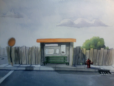
Wow, I kind of disapeared for a few months there. Awesome stuff everyone!
This is a BG I painted for a top secret super awesome project. Sorry for the bad image quality, I used photobooth (scanner temp out of commission). Otherwise the sky is a little brighter, heh. Did this in watercolors so it will be difficult to change anything (I can photoshop though and I can still add). I was wondering if you guys could let me know what you think? I could use a fresh set of eyes. Thanks!

The color looks great as always, Rache.
ReplyDeleteThe one thing I think with this piece that could make it better is that everything seems to be on the same horizontal line. The top of the stop sign, bus stop, and tree all line up. If they were at different heights you could play with the rhythm of the piece and lead the eye around. I know this isn't something you can fix, but perhaps for future endeavors.
I know this isn't a big thing, but I like how you made the tree and the fence in the background with less contrast to add atmospheric perspective. I always forget to look out for that in doing a background.
Im not so much bothered by the horizontal plane made by the roof, trees and stop sign. I think becasue of the uneven ground plane. What I would like to see a little more would be the bus stop covering thing have a little more pop becasue it seems like its the center of attention of the background, maybe a little thicker line work, or something to draw attention a little bit.
ReplyDeleteI guess if in the shot it is just that, a background, i can see why you would leave it a little more subdued.
I really like the way you handled the shadows and the texture created from the watercolor. YEY traditionally done backgrounds!
Good spotting Juno. That's actually not as difficult to fix in post. A little clone tool here, a little copy paste there, problem solved. Yay for technology! I like your idea also Mike. I might play around with it in post. I'll probably post what it looks like with the characters on top. Thanks guys ^^
ReplyDelete